Heading 1
Heading 2
Heading 3
Heading 4
Heading 5
Heading 6
This page illustrates how a long web page should be styled so that it looks good and is as usable and accessible as possible.
Web pages should usually be concise and to the point. However, sometimes you do need longer webpages to explain things in detail, just like this page. The great thing about using proper styles like headings and lists effectively is that they add structure and readability to longer web pages by breaking the information into digestible chunks.
There are all sorts of other reasons why you should style pages correctly. If you follow the rules here, your site will be more accessible, more easily found by search engines, more consistently styled and more usable to all site visitors.
Why headings are important
Visually, we are used to seeing headings diminish in size as they become subheadings of the heading that precedes them, and vice versa.
Imagine a text book or an annual report. The cover has the biggest heading, the chapters have smaller headings, the sections within chapters have smaller headings still, and the subsections of those sections are smaller still and so on. This gives structure to a huge volume of words which helps users find what they are looking for and understand the heirarchical relationship between bits of information.
It is simpler in websites, but the way we use headings in web pages still defines their structure both to readers and search engines. Most importantly, headings help users skim pages looking for keywords and related information. This makes your site more usable, and your users less likely to call you to ask for that information.
Headings help users skim pages
Scroll down this page and then back up to here.
Your eyes can quickly scan this page, jumping from heading to heading. You now have a summary of what the page is all about. You can also see whether each heading is at the same, or at a lower or higher level of importance by its size. We make learned but subconscious judgements about content structure and relationships from heading sizes and styles when we read.
Now, imagine this page as a block of 30 paragraphs with no headings. It would be much harder to see what it was all about or quickly skim the page for keywords or relevance.
Headings help search results
Just like our eyes, computers need content ‘structure’ too. Google search results weight a page differently based on whether search keywords are in an Heading 1, Heading 2, Heading 3 or just paragraph text.
For example, all things being equal, a search for the word “fruit” should return higher results for a page with the word “fruit” in a Heading 2 than a similar page where the word “fruit” is only mentioned once in normal paragraph text. It assumes the first page is a better match to your keyword search because it has a section (identified by the Heading 2) of text about “fruit”.
So the heading levels in webpages are one of many variables that have ‘meaning’ for search result calculations.
Headings are good for accessibility
The same is true for the assistive technology screen readers (like Jaws) that read out webpages or word document to blind users.
Imagine, for a moment, that you’re not able to either see or read the screen, and you rely on a screen reader, which reads out page content to you, really fast. A screen reader can’t tell where a heading that has been manually styled as ‘Tahoma, Bold, size 16’ and its associated content sits within the overall hierarchy based on how it looks, because it doesn’t ‘see’ the content the way our eyes do.
In order to get around this, we need to apply proper heading styles, and thus the html heading code that goes with those styles, that tell the screen reader and thus the blind user, where each heading sits in the scheme of things. This allows users of assistive technology to better skim and navigate through text using a keyboard. It makes a world of difference and is a key part of making your website accessible.
What are the different heading levels and what are they used for?
Heading levels are used to denote where blocks of content sit within the overall information hierarchy of a page. There are six heading levels, h1, h2, h3, h4, h5 and h6 used on the web:
Heading 1 (h1)
Heading 1 will be used on the title of the page, with the content that follows it containing the primary information on the overall topic of the page. It is best practice to have only one level 1 (h1) heading on each page (the page title). It should describe the topic of the page as clearly as possible, in terms the reader will understand.
Heading 2 (h2)
Heading 2 is the style for content that relates to a specific subsection of information within the broad topic as defined by heading 1.
Heading 3 (h3)
Heading 3 is the style for content that relates to a specific subsection of information contained within the preceding level 2 (h2) heading.
Although you can continue on to levels 4, 5 and 6 in the same way, these levels are rarely used, given that webpages should be as concise as possible. However the same principle applies.
Where do heading styles come from?
Most of the time you write your web content in a word doc, or adapt it from there. That’s where your headings should be. However, our experience shows that about 50% of people don’t use styled headings in word! They just manually style each and every heading each time, selecting the font and the size. This is bad practice, but all too common.
You should be setting heading styles and using them in your word docs all the time everytime – see below for pic of these mysterious heading style buttons.
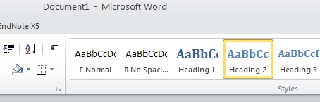 Word’s heading style buttons
Create your own word templates
Consider creating a standard word template which contains organisational styles. This will help you maintain standards and produce consistent looking material.
It should be available from each staff members version of word, and staff should be shown how to use it correctly. This template should form the foundation for all word documents created by staff.
Things to watch out for when making headings
Don’t underuse or overuse headings. As a basic rule of thumb on a webpage you might need 1 heading for every 2 – 4 paragraphs of text. So a short page (2 – 3 paragraphs) may just need a title and thats it.
Each time you use a heading, make sure that you have content that sits underneath it before you use another heading. The content should contain some framing content so the reader knows what’s coming.
Headings represent content structure so you should never skip levels of headings; for example, for content that was a direct subset of an h2 heading, you’d put it under an h3 heading, you would not choose an h4 heading style.
Styles from word import into your sites wysiwyg editor
If you paste your content to your websites wysiwyg editors paste button from properly styled word documents it will automatically displ
ay the headings and other styles, converted to your websites equivalent styles, in your webpages.
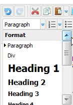 Content editor style drop down box
Make sure that you always access the heading styles from the WYSIWYG format editor.
How to style a page for the web
If every heading on the page was, say, a heading 1 (h1), your page would have no structure, because every block of content would look as though it were at the same level of importance – there would’nt be any heirarchy. Take a look at the following incorrectly structured list which features on a page called Food:
- Food
- Fruits
- Apples
- Pears
- Oranges
- Vegetables
- Carrots
- Potatoes
- Beans
Everything in the above list is at the same level, but we want it to show that apples, pears and oranges are examples of fruit and that carrots, potatoes and beans are examples of vegetables. Now take a look at the list correctly set out:
- Food
- Fruits
- Apples
- Pears
- Oranges
- Vegetables
- Carrots
- Potatoes
- Beans
- Fruits
View a correctly formatted version of such a page.
Bulleted and numbered lists
Another important part of good page layout for the web is the use of lists. The use of bulleted and numbered lists in webpages allows the reader to:
- Skim text faster
- Understand key points quickly,
- Identify important details or options at a glance
Make sure that the first word in the list follows on from the last words of the introduction to the list. In the above example, you can read ‘… allows the reader to skim…’, ‘…allows the reader to understand…’, etc.
Ordered lists are usually best suited to deliberatley sequenced information lists eg;
- plant the seeds
- water the plant
- harvest more seeds
Links to documents
To help links to documents stand out from text and other webpage links, we recommend you make links to documents in the following way;
Download: The title of the document you are linking to
Download: The title of the document you are linking to
Notice that we added a link to a word version of the document first. This is an accessibility practice we urge you to strongly consider doing. Remember your correctly style Word template above? If you upload such documents to your site ready for people to download they are far more readable by assistive technology than matching PDF files out of the box.